Wednesday, September 30, 2009

NA: kinetic type story board animation


This is my entire "final" story board for the kinetic type animation. The only image I felt pertinent to include from my original animation is the one shown. I took that image, printed it out, then crumpled it a bit at a time, scanning it in after each crumple. I then took the frames and am going to play them backwards as the "brayer" rolls back and forth over the image, in order to "flatten" it out.


From there, brayer will "spread" (ink) over the plate, and then eventually cover the entire frame, filling it with black.


Then the black will zoom out as the brayer "rolls" into view. Brayer will roll back and forth a few times before filling the screen again with black.


End.

Typo3: Project 2, COVER and (1st iteration) layouts


This image is the entire trim of the cover (front, back, spine, insets). I chose the image of the mannequin because I believe Stein is speaking to the viewer in terms of misdirection (nothing is as it seems), fabrication (we can make anything in the world that we want), and possibly with a spice of feminism (she speaks at lengths about food and objects and other things relating to the home and the life of a woman).


The second image here is how the cover itself will look when it is all folded up. I may still need to tweak the type a bit. 


This is the "full title" spread of the inside of my book, pages 0 and 1.


Gertrude Stein is on the same base line as all the rest of my called out text. 


This obviously is the CONTENTS page. Page 2 and 3. I'm just trying to go with really clean and classical layouts. The semi-bold italic type is a factor that plays through the entirety of my spreads. 


Sugar and Dirt Not Copper spread. The idea of calling out text was a main deciding factor for me throughout the creations of these layouts. The titles of the pieces are in the same side line in the margins with the page number and title of the collective works. I left wide margins around the  main text to further along the idea of classical text. 


PS- I DID replace Malachite with A Shawl and A White Hunter with Book. The two I replaced were too short to successfully portray the gaps in thought that I wanted to show. The two new poems are longer and were more successfully interpretable. 

Friday, September 25, 2009

Frenchie

Johnna showed this to me and I've been watching it ever since. This is the cutest damn puppy on the planet. One day I will own it.


NA: process type animation

My chosen words: 


Gouge- carve dig slash
Brayer- spread roll smear


I decided to continue with Brayer, but the sub words evolved into Spread Roll and Flatten.


I am going to incorporate several images from my combined animation into the animation of my text. In other words, both image and action with the type will appear in the same frame and interact with each other. 

This last image is my preposed story board for the incorporation. Flatten, spread and roll in that order. 

Thursday, September 24, 2009

VisLang: Redo- Kodak Camera ad.


This camera company's ad from 1888 is representational of the historic events leading to mass production of photographers everywhere.

September 1888

Tuesday 04:

George Eastman registers the trademark Kodak, and receives a patent for his camerawhich uses roll film.


The word "Kodak" was first registered as a trademark in 1888. There has been some fanciful speculation, from time to time, on how the name was originated. But the plain truth is that Eastman invented it out of thin air.
He explained: "I devised the name myself. The letter "K" had been a favorite with me -- it seems a strong, incisive sort of letter. It became a question of trying out a great number of combinations of letters that made words starting and ending with 'K.' The word 'Kodak' is the result."


Eastman built his business on four basic principles:
  • mass production at low cost
  • international distribution
  • extensive advertising
  • a focus on the customer
In 1889, the Eastman Photographic Materials Company, Limited, was incorporated in London, England, to handle distribution of Kodak products in countries outside the U.S. At first, all goods were manufactured in Rochester. Before long, the combined international and domestic demand outpaced plant resources.

This link leads to a page talking strictly on advertisements for Kodak in the 1880s.

I believe this particular ad is targeting upper-class adults that wish to try their hands at photography. The above link talks about the first Kodak camera costing the equivalency of about $500 in the year 2000. Thus it is not something the poor could afford at the time. This was to be a rich-mans sport. 

This link is about Paul Nadar, who was Eastman's agent. He was an artist, though photography seemed to be his forte. There is no listed artist for the ad I have chosen to recreate, but the illustration of the camera was used in several Kodak ads. 

The ad is broken down into paragraphs, thus hierarchy are important. There is a good combination of serif and sans serif type faces. It is simple, and yet contains a lot of information. 

I believe this ad falls under the idea of Logos. The ad is very factual  and logically stated in order to show the public that this is something easy to use and for the public. Easy to use over and over and over again. 

Wednesday, September 23, 2009

Daisy St. Patience


This is a photo I took today at the River Market. 3 points if you know the reference I made through the title.

She is the epitome of beauty. I might have to go buy her. Hopefully she walks on the left.

Monday, September 21, 2009

My life is average.

My Life is Average makes my life better.

By clicking this link you will automatically become addicted and I will be your new favorite person.

Sunday, September 20, 2009

My Head is a Jar

My head is a jar.

Every time something new slips between into my head, a little plink echos in my ears. You can't always see the thoughts clinking about because there are layers and layers of them. If you could see them all at once, my head would cease being a jar, and would instead be a double-sided picture frame. You know the kind. You buy one, thinking to show off your college football jersey, then go to hang it on the wall and realize it didn't fucking matter any way if you could see both sides or not at the same time. One way or another, something will have it's back to the wall. Two sheets of glass just make it more breakable.

My head does not hold pennies. It is not a penny jar, or even a nickel jar for that matter. It's more like a catch-all. Bits of paper, scraps from my day. Receipts, to-do's, maybe a tube of Burt's Bees. If I hear a song, a few chimes get tossed into the mix. Not enough to remember who sang the song, or even where you heard it, but enough to repeat over and over. Enough to catch yourself humming randomly. Enough to bug the piss out of you.

I think my head as a jar is a good thing. If you drop me on my head I'd break open like a penny jar though. Then I'd lose everything I have spent this long collecting. Gold and brown bits all over the floor. But until some asshole comes along and drops me right on my jar head, you can always add more. If my head gets too full, I can reach in and remove any of the old stupid things that have gathered. Like leaves in a fox hole. Crumbs in a utensil drawer.

I don't know if there is a lid or not for my head. I probably lost it a long time ago. I probably set it down somewhere when I was little and someone finally chose me to play kick-ball. You can't hold onto a lid for your head forever. Little kids are always leaving stuff behind. Stupid.

I like the way everything rustles together when I move. I can dance to an orchestra by just bopping my head. Shifting my weight. Almost-tripping. Every time I blink, or sigh, I get another plink. Nothing to see here folks. Just a girl with a jar for a head. Drop something in or leave it alone. Go shuffle your thoughts somewhere else.

When you crack an ice cube tray to get the ice cubes out, I think that's how my head might sound if you dropped me from a not-so-great distance. Like a spiderweb in safety glass. Gummy bits that don't necessarily fall out of the frame right a way. A shriek and a pop.

My jar-for-a-head does not get cold. Which I guess is good. They don't make hats for jars. Those glass bottles and cans and stuff have coolie-cups and all, but jars just don't seem to have any protection. Are jars easier to break in the winter? If a bug ever got into my head, I don't think it would matter if it were winter or fall. I'd smash my own head against the concrete until I shattered.

It's okay that my head is a jar. It really is. I am my own conversation starter. I am equally, if not more, as unique as you are. I amuse myself with my own hiccups. If you can hear the stuff rolling in my head, I can inspire movement by tilting slightly to the left, then back again.

What can your head do?

Typo3: Project 2- Poems

For our book project, I have chosen the poems: Dirt and Not Copper, A White Hunter, Malachite, This is Dress Aider, and Sugar. For my first couple of iterations I used Malachite.


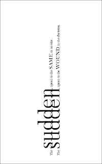
I really enjoy the idea of the sideways text. I believe it makes the poem more interesting and almost turns the text into a landscape. 

VisLang: Peplowski, Final-final.

My final Peplowski poster is seen below. I chose to use a visual pun to illustrate Peplowski's fun rendition of Benny Goodman's music. I did this through the image of an upside-down clarinet, supported by the tag line "turning the classics upside-down."

The thought came up that my poster was too "flat" in it's strictly vectored form. I decided then to bring in a picture I took while I was at the folly. The picture in the background is not the outside of the folly, but is instead of the inside, back behind the scenes, where many performances have come and gone. I thought this was a good choice because it also helps speak to the past/"roots" of the Peplowski performance which is something I had wanted to incorporate into my original design anyway. This is just a more literal way of doing that.

Tuesday, September 15, 2009

Purple Roaches in the Basement

Purple Roaches in the Basement
Right now there is a roach in my bathroom. Right in the middle of the floor. It is dead. It has been there for the last six weeks. Over the last six weeks, it has been the only living thing that has come into my life. But not the only dead thing. Not the only dead thing by far.
I killed the roach that now lies on my bathroom floor. I squished it with my bare foot. I was sitting on the toilet and it ran from the corner. A black streak over the white tiles. Not a care in the world. Until my foot came along and ruined everything. I stared at the smear on the floor for a long time. I don't know why I killed it. A primal act of savagery. Unconfined, uncontrolled.
The little blond girl came before the roach. Sweet silky hair and a purple sundress. Standing by the abandoned swing set. So easy to pluck an devour.
I kept expecting the roach to move. The little girl moved no matter how many times I squashed her tiny frame against the various parts of my anatomy. Roaches are crunchy. Little girls are supple and soft.
I used to read about murderers. Not the old man with a magnifying glass, wrinkled and hunched over a monarch he is pinning to a styrofoam plate. Good looking. Young guys. Sweater vests and carnage. Men who could sweet talk a woman to his web and slash the skin from her smiling face.
The little girls didn't start with sex. They started with the same savagery the roach started with. They scream so sweetly. Rebecca is the purple pixie buried now in the dirt floor of my basement. Forever in silt and sand.
That's all she said as I stabbed her. Stuck on repeat. Stuck on my blade, on my lap.
"My name is Rebecca. My name is Rebecca. My name..."
She escaped into her self. Screamed her own name while I sighed against her neck. Her last words were not words at all. Small whimpers and loose tears. I cried with her. At least I tried to cry. It's hard to feel anything other than cotton fabric. Plastic buttons. Satin bed spreads. Release. Repeat. 
I go to check on the roach. Still there, though a stream of ants has followed it from the corner. Hollowed out by tiny workers. Only the shell is left. Just like Rebecca.
My empty little Rebecca. The hollow bathroom and the filled basement floor. Full ants. Spent body. Uncontrolled. Unconfined. Time to rest. 

NA: Final animations


Making a Print in the First Person Vol.2 from Abby Gallagher on Vimeo.


Making a Print in the Third Person Vol.2 from Abby Gallagher on Vimeo.

Making a Print: Combined Perspectives from Abby Gallagher on Vimeo.

Monday, September 14, 2009

visLang: Peplowski, It's the Final Countdown

These are some of the final iterations for the Ken Peplowski promotional poster. No one but I seems to enjoy the beige.


This one seems pretty okay... BUT!


THIS ONE is better. Someone thought the date was still too big, but Rick suggested bringing down the opacity and that seemed to work just fine. Then I dropped the opacity on the "Benny Goodman" tag-line and liked that as well. I believe this is the one I will end up tiling for the final day. 

Typo3: Mailer Final

Top left image is of the outside panels of my Typo mailer for Caledonia. The bottom left image is of the inside/poster of the mailer. The bottom right image is a detail shot of the inside of the mailer, allowing you to see the alignment of image, patterns, and type. 

Sunday, September 13, 2009

visLang: Poster digital first iterations


These are some of my first iterations for the Ken Peplowski project. I wanted to us a style that could represent his playful, upbeat musical style. The clean lines of Helvetica, I feel, help to make a bit of contrast between my clarinet portrayal.

I believe the blue color will be what I end up choosing. It furthers on the idea of clean/playful music, but it also will make sense since my show will be held in December.

Thursday, September 10, 2009

NA: Project 1: Animations


How to Make a print in the Third Person from Abby G on Vimeo.


Untitled from Abby G on Vimeo.

VisLang: 3x5=15

These are examples of my three possible poster directions. The first two images are for Irony- the idea of Going to Get your Hair done- bouffant hairstyle. Something old and out dated for the new, in the future, show. Ken Peplowski is bringing back Benny Goodman. I'm bringing back the Bouffant.

The second two images will show a Benny Goodman cd playing on a record player. This idea of Bringing back the Classics is shown through anthesis and metonymy.

The last three images are showing a pun. Turning the classics (the clarinet) upside down.

Wednesday, September 9, 2009

Typo3: Mailer version 1/1.5


This is the second version of the inside, the background is a bit different.. kind of textiles... thinking of a hands on process... like a lino-type which is what the typography was designed for.

na: Project 1: Final Story Boards

This is the final version of my 3rd person perspective story board. I really tried to keep things light and humorous. You're supposed to have fun while making a print!

This one is my final version of the 1st person perspective.


these are a couple of close-ups from each story board

Thursday, September 3, 2009

VisLang: Matrix Remastered

The first image is of the entire board, remastered with specific ideas further explored. the right column is of old ideas that I think I'm going to discard. My primary focus is going to be on taking something old, and putting it in todays context. Either though the words that I choose or through a fusion of the two ideas. 
 
The second image here (in black and white because blogger enjoys inverting my images) are a few excerpts from the newly remastered matrix. As I said before, fusing new and old can be seen in the idea of a Dyed Green Beau font hairstyle. The same idea could be procured by using a black and white photo in addition to the words "Get your hair done Tomorrow." 

Wednesday, September 2, 2009

NA: Project 1: New Story Board and such

These two images are the new story boards. In the top of the two 10-frames, I tried to make individual actions a bit more interesting. In the second of the two 10-frame set, I played with the elapsing time. I chose to make the process of "choosing a design" 3 frames, as well as making "Letting it Dry" 3 frames. 
I am still leaning towards the ideas of drawing and collage. I still haven't tried multimedia collages and I think that might be the next step I take if collage is the way I try to go with this project.