
Tuesday, March 30, 2010
Monday, March 29, 2010
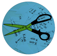
Typo 4: X-am Conference Dayz
300 Registered Attendees (not including guest speakers, staff, lecturers)
3 day event
College campus: Classrooms for smaller gatherings, Auditorium for "open to all" events, Cafeteria
Mornings: (does not include first day with registration)
Workshops (hands on interactions, 1-2 professionals/15-20 people per room, several going on at once)
Keynote Presentations (professionals talking about themselves, issues in their work, personal
experience 20-30 people, several going on at once, time for questions)
Round Table Discussions (interactive discussions about design, issues in design, thoughts of the
future. 1-2 professionals/10-15 people, several going on at once)
Afternoons:
Booths open (one main room, free time, time to see demonstrations/network/pick up business or
school materials)
Portfolio Reviews (one on one interactions professional-student, professional-professional, time for about 3 reviews per attendee)
Lunch (open/free time for individual or group interactions, on or off site)
Evenings:
Lectures (by guest speakers/renowned designers, auditorium setting, open to everyone) (one per night,
possibly replaced by debate)
Debate (guest speaker to guest speaker, auditorium setting, open to everyone) (one per night, possibly
replaced by lecture)
Dinner (open/free time for individual or group interactions on or off site)
Mixers (dance/open bar/site seeing, time for social networking, open to everyone)
Typo 4: X-am Conference inspiration


Sunday, March 28, 2010
Typo 4: X-am paraphernalia, round one
a one inch button, a 3x5" name tag, and a tshirt- blue for attendees, green for staff.


Thursday, March 25, 2010
Typo 4: XAM: Final Conference Title and Paragraph
X-am is a typographic conference designed to bring together beginners and professionals of all artistic backgrounds. The conference is meant to open your eyes and allow you to take a close look at how subtle changes in a set of variables can radically alter a typographic form. Participants will attend lectures, workshops, critiques and social events with the intentions of gaining inspiration and growing as a designer and as a person. Workshops will explore analogue means of altering type through the use of every day items (mirrors, scissors, flashlights, paint, etc.). This three day conference will prove to be inspiration and hopefully allow you to generate new ideas for the construction for your own unique and personal means of type design.
Artist Bio:
RICK GRIFFITH, DESIGN DIRECTOR
"We are architects of the written word who believe that near every design challenge we encounter can be solved through effective representations of language. Through custom typography, and design, we strategize and implement effective communication vehicles to produce enduring solutions."
For just under 20 years, Rick Griffith has sought clarity about art and communication through the broad discipline of design. His projects & commercial works and projects have been cited in several national and international resources including TDC, AIGA 365, Print, Dwell, and Good Magazine. He has works published by Rotovision in the UK and Lawrence King and Rockport in the US. His and MATTER's work is included in the AIGA National Design Archives, the Denver Art Museum's Design permanent collection, The Butler Library of Rare Books and Manuscripts at Columbia University, and the Tweed Museum of Art at the University of Minnesota, Duluth.

DESN305: ACME identity, round four point five
Added a bit of texture to the background on the red. The cookie image on the box was a stock image I pulled from the net, I know it's pixelated like crazy and I plan to replace the image... but the chocolate bottle is great in my opinion. I need to pump up the contrast on the sprinkles in order to keep some of the true red the way the chocolate bottle does. The two black and white images are the images I took to pull the texture from. Cheers.


Wednesday, March 24, 2010
DESN305: ACME identity, round four
Black and white mock-ups. After careful consideration, I believe the form of the "cookie crumbs" packaging will change to a more rounded and plastic form for the sake of consistency. The red color from before will continue to be my main color scheme but I'm working on bringing texture in to break up the monotony of the main color. 


Sunday, March 21, 2010
Typo 4: Conference: Possible name list, mini descriptions, bio
Type and Fragmentation
Tyfrag
Distortype: The fragmentation and distortion of typopgraphy
T Frag Squared: Typographic fragmentation in all it's forms
FTAG: Fragmented Type Conference 2010
***FRAG: Fragmented Type Conference 2010
***X-AM: Fragmented Type Conference 2010
FRAG is a typographic conference designed to bring together beginners and professionals of all artistic backgrounds for the purpose of learning and discovering new ways to fragment existing typographic forms. Participants will attend lectures, workshops, critiques and social events with the intentions of gaining inspiration and growing as a designer and as a person. Get ready to shake some shift (keys) up!
X-am is a conference designed to open your eyes and allow you to take a close look at how subtle changes in a set of variables can radically alter a typographic form (for better or worse)! This three day conference will prove to be inspirational and hopefully allow you to generate new ideas for the construction of your own unique and personalized means of typesetting.
RICK GRIFFITH, DESIGN DIRECTOR
For just under 20 years, Rick Griffith has sought clarity about art and communication through the broad discipline of design. His projects & commercial works and projects have been cited in several national and international resources including TDC, AIGA 365, Print, Dwell, and Good Magazine. He has works published by Rotovision in the UK and Lawrence King and Rockport in the US.
His and MATTER's work is included in the AIGA National Design Archives, the Denver Art Museum's Design permanent collection, The Butler Library of Rare Books and Manuscripts at Columbia University, and the Tweed Museum of Art at the University of Minnesota, Duluth.
During the last 15 years, he has taught graphic design and typography for the University of Colorado, Denver, The Rocky Mountain College of Art and Design, and most recently, The University of Denver. He serves as lecturer and panelist for conferences and presents frequently on either his method for teaching and practicing as a designer/typographer or the model of professional practice, leadership, and constant experimentation of the studio and type laboratory called MATTER.


| If intelligence is equated with the knowledge that no answer is absolute, if it requires a constantly questioning mind, then MATTER is one intelligent design practice. In fact, MATTER isn't just practicing design: MATTER is designing design. We are architects of the written word who believe that near every design challenge we encounter can be solved through effective representations of language. Through custom typography, and design, we strategize and implement effective communication vehicles to produce enduring solutions. |
Saturday, March 20, 2010
DESN305: Packaging inspiration from Colorado
Packaging images from Colorado that Lance asked me to take. 


Friday, March 12, 2010
Typo 4: Conference: Mind Map round 2
Over view and detail shot. The organization is broken down to four main sections: Who, Where, Interactions, and Artifacts. From there, each section is further broken down to key points and sub points (based on the justification) and then broken into color selections for further organization (informative vs promotional, worker vs attendee, etc.). 


Typo 4: Conference: Theme
a written paragraph about your conference theme is due next class period. define/describe the depth and breadth of your typographic focus as well as its importance to the field.
TYPOGRAPHIC FRAGMENTATION
This will be a hands-on/analogue typographic experimentation conference based on the concept of fragmentation. This involves found type/computer generated type that is altered in various ways. Mirrors, scissors, reflection, photography, etc. Negative and positive space will be explored, altered, and ultimately fragmented. The final outcomes will be physical/tangible products that will be digitally captured and documented. The computer has over taken most aspects of the design world. People rarely rely on analogue methods anymore. Why use a mirror when you can "do everything in photoshop." The purpose of this conference will be to prove that analogue can produce beautiful outcomes that may never be generated by a computer. The computer is expendable, type is easily replicated. Analogue type is unique and un-duplicate-able.
DESN305: ACME identity
Working with the latest version of the acme identity. With the help of Lance and Micah, I've decided the red background works the best, as does double line above and below the specific "what is it" title (cookie crumbs, chocolate syrup, sprinkles." I'm also playing around with the concept of a new icon as seen below. Tom helped bring up the point that cones don't generally get random toppings thrown on, it's usually sundaes that get the extra bits. The Nutrition Fact bar will exist in a rounded-edges knock-out shape to be cohesive with my rounded ACME type. 


Wednesday, March 10, 2010
InfoArc: MCCOY/VIGNELLI markup
Mark up and latest formal layout. All picture-shapes will have a roll-over state and a resting-state. All links will pop up on the same screen. Massimos stuff will appear on the left, Mccoys on the right. Boxes will have to be closed in order for a new one to become opened.


DESN305: ACME identity, round whatever


Monday, March 8, 2010
DESN305: ACME identity, round two
With the mouth dubbed (no pun intended) "horror movie" esque, I decided to try a different direction for my soccer-mom-savvy ice cream toppings line. The far left were different fonts obviously, playing with letterforms. I decided that acropolis was a fun, fresh, semi-classy font that could work with the form of the icon. Kidwell does not like the icon, so I've tried a few with and a few without. I'm still stuck on the format of my three packages... I hope to settle that dispute tonight. I'll know more about my forms at that point.


Saturday, March 6, 2010
Typo 4: Project 2- Conference Mind Map (huge, yes)

Timeline of events
receive info about the conference
decide to go
get directions to venue
drive to venue
park at venue
register
receive: name tag, tote bag, shirt, schedule, map of events
----------Repeat below events if a multi day event---------
Walk around
visit booths
go to talks/discussions/critiques/workshops
free time
more booths/talks/critiques/workshops
meal
hotel
social interaction
leave
Wednesday, March 3, 2010
DESN305: ACME identity, round one
I had two directions I could choose to go for my ACME ice cream topping package design, the first idea was to go classic with abstract symbols, script font and muted "classy" colors. This would have appealed to the rich mom's-mom and could have limited my my audience to haughty women trying to show off their wealth. (None of the images shown are for this idea)
The second direction I had in mind is the way I'm going to go. It's fun and playful with big punchy solid (possibly silk-screened) patches of color. This will appeal to a younger audience and the kid that is still in most adults. This is for mom's that know how to have fun and still like to indulge themselves. Spoil the moms for once instead of the moms doing all the spoiling (of their own children). The sketch below was the original direction. Kidwell pointed out that the colors/rendering style are vaguely Frykholm-poster-esque. Below the sketch are a few quick illustrator directions with two main color schemes in mind, sprinkled lips or not, green vs blue, pink vs purple, white vs yellow...


Monday, March 1, 2010
DESN305: 3 Panels
These are the boards for my ACME product line. As a refresher, I'm creating a line of ice cream toppings generally for the upper-middle class soccer mom. The visual research board is full of color pallets, illustration styles, line qualities, compositions and general aesthetics that I find appealing. The consumer board shows the modern mom as a trendy health-conscious home keeper. It might be a sexist view but I believe it also might empower moms to do what they want, keep up their own bodies, and maintain a happy home life all at the same time. After talking with Kidwell, I need to add women of other races, more foods to the comparable board, and potentially separate expensive class from cheap necessity on the comparables board. 


Subscribe to:
Posts (Atom)