X-Am is a three day conference focused on merging two ideas. The first being taking a close look at typographic forms, and the second being fragmenting those forms in various manners. I tried to emulate these themes by using abstract forms in the background and type with minimal stylistic treatments in order to avoid leading the viewer down a predetermined path before the conference. I chose to create a mailer for my conference that a potential attendee would receive about 6 months before the conference in order to publicize the event and gain interest. The website would be online ideally 8 months before the conference in order to make information about the event easily obtainable, registration easy, and to promote the speakers for the event. The name tag is a poetic experience the user would receive at the conference. By placing the persons name in the triangle shape I attempt to make it clear that everyone has the ability to fragment typographic forms and become a part of the experience. My overall identity is a poetic experience, leaving the viewer to interpret the concept by their own standards. The mailer and the website serve as practical means of expressing an idea. Are there any questions?
Friday, April 30, 2010
Wednesday, April 28, 2010
Tuesday, April 27, 2010
Monday, April 26, 2010
Sunday, April 25, 2010
Friday, April 23, 2010
Typo 4: X-AM Artifact Progress
This is the mailer, Left panel is the outside, unfolded obviously, and the right side would be a poster you could hang on your wall. The second image is just a close up of my type treatment on Griffith's bio.
Final Website:
Name Tags (digital. photos of actual artifact to come)
InfoArc: Collection: more iterations
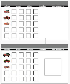
This is a still-early rough draft of the micro machines collection website. Since talking with Epp, the timeline page will not have a reveal factor, you'll simply see all the cars in relation to their years from the get-go (like I had wanted to do from the start. Why make things clickable if they don't need to be?).
Thursday, April 22, 2010
Wednesday, April 21, 2010
DESN305: Sticker Map, round deux
Round two changes consist of bigger stickers, better original body copy, different photos/stickers (updated to remove the "F" from the (f)art sticker as well as to include some new stops), higher contrast, and different images taken from correct angle (taken from direction walker would see it- pre getting there).
Feedback: size of the stickers is good, get rid of back-to-back stops that happens two of the pages, possibly include a border around white space on the b/w sheets in order to more clearly denote where the stickers are supposed to go, get rid of on-the-ground graffiti image, add an image at the bottom of the stairs so you know where to stop and look around for the first sculptural image down by the second set of birdies. Positive: good interaction with stickers, good use of non-word/image based direction.
Monday, April 19, 2010
Typo 4: X-AM Mind Map updates
So... I changed some colors and did some rearranging (primarily on the Artifact tab) and then I added some information to the timeline (what each thing in the days-of-the-conference requires) as well as making the days-of section smaller to designate a lesser amount of time than the months and months out from the conference.
Thursday, April 15, 2010
Ffffound! things that I enjoy
Strange to me.... I looked through Fffffound for a long time and only saved these images. It's curious that only one of them have color and even then it is primarily gray I guess I was in a pretty-photo kind of mood.
InfoArc: Collection: Homepage options
These show a few options when it comes to the home page of my site. Any combination of car renderings/highlights can be used in the place of rollover and click-down states. The navigation can also get broken up differently, trying out Universe and Verdana as my fonts, with a possible italic rollover state. The pop up image will probably be photograph, which is why the vector only shows up once in the below sketches/mockups.
Subscribe to:
Posts (Atom)


