 |
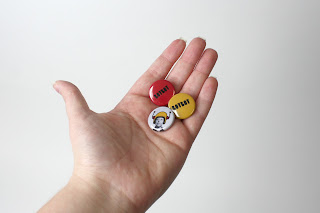
| Refined home screen. |
Tuesday, November 30, 2010
Monday, November 29, 2010
MMEXP: Portfolio Site, Round 2
Tuesday, November 23, 2010
Artist Statement
Artist Statement
I was asked to write a statement about my style as an artist, and I cannot tell you how much trouble that simple problem has given me. My design work is where my professional "artistic" energies go, but I do not necessarily consider that my "art." I like building things out of paper: little towns, stop-motion animations, layered cards and images. I enjoy sketching creatures that come to me from dreams. I like smooth lines and subtle curves when it comes to ceramics, and I like the remnant linoleum lines in my prints when I don't cut deep enough to vanquish them from the paper I print on. I believe in the concept of "art for art's sake" and will fight tooth and nail with anyone that tries to disprove its existence. I tend to like muted colors, large type, irregular forms, and narrative styles whenever possible. I like to tell stories, so the "narrative styles" bit is something I should probably emphasize more in this little summation of who I am as an artist. I like a linear progression of elements with a crescendo finale. The "cooler" I can make something look the happier I am. Is that a good start? I'd say so.
I was asked to write a statement about my style as an artist, and I cannot tell you how much trouble that simple problem has given me. My design work is where my professional "artistic" energies go, but I do not necessarily consider that my "art." I like building things out of paper: little towns, stop-motion animations, layered cards and images. I enjoy sketching creatures that come to me from dreams. I like smooth lines and subtle curves when it comes to ceramics, and I like the remnant linoleum lines in my prints when I don't cut deep enough to vanquish them from the paper I print on. I believe in the concept of "art for art's sake" and will fight tooth and nail with anyone that tries to disprove its existence. I tend to like muted colors, large type, irregular forms, and narrative styles whenever possible. I like to tell stories, so the "narrative styles" bit is something I should probably emphasize more in this little summation of who I am as an artist. I like a linear progression of elements with a crescendo finale. The "cooler" I can make something look the happier I am. Is that a good start? I'd say so.
Wednesday, November 17, 2010
Tuesday, November 16, 2010
portfolio sites to look at.
http://www.diegolatorre.com/
http://bechira.com/#project/all/designcollector-7-illustration
tonicup.com
http://dannyblackman.com/
http://digitalmash.com/
http://www.blkmtnstudio.com/#/portfolio/print
http://bechira.com/#project/all/designcollector-7-illustration
tonicup.com
http://dannyblackman.com/
http://digitalmash.com/
http://www.blkmtnstudio.com/#/portfolio/print
Monday, November 15, 2010
Sunday, November 14, 2010
Friday, November 12, 2010
VisAd: Collaborative icons
 |
| all of the possible icon styles |
 |
| Direction Two. ...This. Equals... |
 |
| This! Direction Three. With and without eyebrows. |
 |
| This is the fairly finalized set. No faces, new color scheme. Yay. |
Thursday, November 11, 2010
VisAd: Sign Layouts R01
The far right signs represent the back of the board. The squares inside of the band on the left will be interchangeable magnets with fruit/vegetable icons. The market vendors can change out the icons on a week by week basis so the people that see the signs will always know what's available that day. The arrow icon will also be a magnet that is rotate-able so the signs can be placed anywhere the market chooses.
The sign is going to stand at 5 feet tall. The sign-area itself will be 2' wide by 4' tall, and the material will be 2 metal sheets that are hinged together at the top (metal allows for the ease of the interchangeable magnets). When standing, and when you're viewing the sign from the side, it will form a triangle. The bottom of the triangle will collapse upwards, allowing the sign to lay flat in order for easy transportation.
The sign is going to stand at 5 feet tall. The sign-area itself will be 2' wide by 4' tall, and the material will be 2 metal sheets that are hinged together at the top (metal allows for the ease of the interchangeable magnets). When standing, and when you're viewing the sign from the side, it will form a triangle. The bottom of the triangle will collapse upwards, allowing the sign to lay flat in order for easy transportation.
Sunday, November 7, 2010
Saturday, November 6, 2010
DESN405: BOTBOT Commercial (Part B)
BOTBOT Commercial from Abby Gallagher on Vimeo.
This is just a little commercial advertising BOTBOT: The Robot Spot. The use of stop-motion animation techniques showcases the hands-on aspects of the actual museum activities, as well as the "modular," "fun" and "building" aspects of the museum brand campaign.
The song is "Van Helsing Boombox" by Man Man. It was chosen for it's light-hearted beat, and fun pace. The song elements "build" on one another, further instilling the "building" attribute.
Friday, November 5, 2010
Thursday, November 4, 2010
VisAd: Sign Colors R01
 | |
| this is the existing logo for the Rosedale Farmer's Market |
 |
| The three colors on the right were directly taken from the logo. |
 |
| From there, I added a 10% black mix to each swatch in steady increments. |
 |
| These are a few possible groupings that could be utilized on the signage. |
Subscribe to:
Comments (Atom)


